Colour as a Narrative Device
Many films, particularly those with complex or multi-layered narratives shifting between levels of reality or past and present, use colour as a means of subtly or overtly letting the audience.
In 'Memento' (Christopher Nolan, 2000), there is a complex narrative structure involving two timelines, one showing scenes in chronological order and the other in reverse chronological order. Creating a visual distinction to avoid confusion, these two sets of scenes are coloured differently: one in black and white and the other in colour.

These two narrative strands actually meet in the film's climax, foregrounded by a colour change during a shot.
Mills also cites a quite from DOP Roger Deakins, speaking on the convention of using black and white to convey important narrative/story elements:
'Black and white focuses you on the content and the story, and it really concentrates your attention on the frame. All too often, colour can be a distraction - its easier to make colour look good, but harder to make colour service the story. Black and white imagery is much more about the balance between the light and shade in the frame, and I think it can help to convey story points a lot better with fewer distractions.'
Another film which makes use of colour as a narrative device is 'The Matrix' (Lana/Andy Wachowski, 1999). As the film switches back and forth between the 'real world' and the computer-simulated world (and the threats faced in those separate environments are distinct), it was necessary to implement a visual device to avoid confusing the viewer.
In this case, the colour green is used in the Matrix (with links to the green computer screens of the time), and a darker but more natural palette in the real world.


At the start of the film, Neo is in the Matrix but neither him nor the audience are aware of this - and we accept the sickly, pale green hue as just a stylized representation of his reality. Ultimately, the audience undergoes the same awakening as Neo does when he is introduced to the real world, and the introduction of colour, contrast and saturation 'mirrors the freshness that the real world offers'.
In addition, the pale, monochromatic greens and lack of colour in Neo's world at the beginning represent the oppressiveness and restrictions of the real world. He blends in to the background like a piece of furniture - he is an 'ingrained and controlled part of that system'.

Upon leaving the Matrix, the colour makes him stand out against his backdrop, conveying how he has broken free of such control and has a power over his surroundings. At the end of the film this effect is taken further - Neo is in the Matrix but with his renewed power the colour palette is relatively neutral, with warmer highlights and elements of colour. 'He has transcended the oppression of the Matrix and the stark realities of the outside world, and created a new life'.
Looking at the colour across the entire film, we can immediately see the sequences in both the real world and the Matrix.

The colour scheme across the entire trilogy of films has also been taken further by some, identifying further spiritual symbolism.

| Green is the colour of the Matrix, and represents the 'Mind' |
| Blue is the 'Real world' of Zion and represents the physical body |
| Yellow is the world of the Machines, representing life energy, spirit and even heaven |
| Red is the symbol for corruption, evil and Hell. |
| White alludes to purity, truth and the mysterious Source - used when Neo is shown about the real world. |
As an interesting side-note, the use of green has been recognised as both a convention of science fiction films and films where the perceived reality is 'off-kilter', such as Fight Club (David Fincher, 1999).

Similarly, 'Pan's Labyrinth' (Guillermo del Toro, 2006) uses colour codes to separate the various worlds which Ofelia travels across.

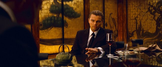
As another film with multiple layers and cross-cutting between different scenes, Inception (Christopher Nolan, 2010) uses colour to make these environments subtly but visually distinctive. Speaking on the film in this interview, DOP Wally Pfister describes his choice for colour scheme:
'Each dream has a different colour scheme so Chris could
cut back and forth without confusing the audience'
He also describes how their mantra of dreams 'feeling real' influenced their decision to keep the colour schemes in the dreams earthly and believable, but feeling slightly other-worldly. For example, a gun-metal gray/blue tint was used for the city car chase sequence.
A rich golden, almost sepia hue was used in the set design for the film's opening sequence, conveying the dream host's wealth and also the protagonist Cobb in his prime.
A bleak, desaturated palette of grays and blues in 'limbo' convey the age, decay and emotional emptiness of the environment.
And a monochromatic colour scheme of whites, grays and browns was used for the final dream sequence in the snow. With the connotations of the colour white representing purity and truth, it can be seen to be appropriate that this pervading scheme is chosen as we are reaching the innermost part of the characters' mind where they discover a life-altering truth.

In 'Eternal Sunshine of the Spotless Mind' (Michel Gondry, 2004), another film dealing with multiple layers and dream sequences, a colour change is used both as a narrative and symbolic device.
The hair colour of Clementine changes throughout the film, stemming from her impulsive and expressive personality. As the scenes in Joel's mind work in reverse to erase his memory of her, these colours represent the various stages in their relationship, but also indicate to the audience when we are viewing a scene in the present day outside of Joel's mind.

Following the images above, working from the end of their relationship to the beginning, many have drawn comparisons to the four seasons; spring, summer, autumn and winter.
In the first image, after Joel has been erased from her memory, Clementine's hair is deep blue, connoting coldness and emotional vacancy, the end of their relationship. The colour is also being washed out from her hair, suggesting she has started anew.
In the second image her hair is bright orange, which links to the autumn theme and suggests the start of the decline in their relationship, losing the full-bodied, healthy brightness of the red in the next image (representing passion and love.)
Finally, in the last image we can see her hair at the start of their relationship, representing spring - the vital greens suggesting their relationship is in its early stages and is about to bloom.
Another film which makes use of seasons and colour palette changes to chart character arc is 'Requiem for a Dream' (Darren Aronofsky, 2000) - as seen in the image below. The warmth and brightness of the start of the film gives way to dark, dingy greens and greys, and unhealthy, de-saturated tones to represent the emotional decay of the characters.

In 'City of God' (Fernando Meirelles, 2002), a colour change is used to chart the decline of an entire community, providing the audience with a visual timeline. Spanning three decades, the film watches a group of children grow up to become involved in a dangerous criminal world, and the set design and grading is used for emphasis.

In scenes set in the 1960s, a golden, sepia tone is applied to the scene, creating a sense of warmth and nostalgia. The streets are wide open, allowing use of wide shots to create visual space.

By the end of the film, after 20 years of development, drugs and decline within the city, the colour has descended into a serious, shadowy blue hue - representing the end of the golden age and the danger that has replaced it. In addition, the built up area creates a strong visual contrast with the openness of the old favela, creating cluttered frames and a sense of claustrophobia as the characters navigate the narrow alleys - adding to the sense of danger and vulnerability that they each feel.
In the flashback sequences from 'Shutter Island' (Martin Scorsese, 2010), a sickly and in-complementary palette of highly saturated greens reds, purples and browns is used. The characters are also lit by unnaturally harsh lighting, stressing the surrealism of the scene.


The visual effects supervisor for the film talks about his this 'disconcerts the viewer and suggests that it has a sort of unrealistic property to it... it looks like it should be a real shot but something's not quite right about it.'
At the end of the film, it is revealed that the main character's memories of his wife are all false, and that he has created them as part of an alternate self. With this knowledge, we can see how the surrealism and unnatural colours in the flashback sequences are a subtle indication to the audience that these memories are not the truth and not to be trusted.
This is emphasised further when Teddy later relives the actual events which led to the death of his wife and children. As this is reality, the colours, lighting and other elements are all naturalistic.


Using monochrome with select saturated colours is also an effective tool to draw audiences to a part of a frame or to create symbolic links to themes, characters and/or emotions.
For example, in 'Sin City' (Frank Miller, 2005) specific objects or character traits are colourized to emphasize their importance and perhaps also to make symbolic links. For example, the colour red on a bed, a characters' lips or dress immediately connotes sensuality, love and passion.

The sickly yellows of the antagonist amplify our disgust and the contrasting greens and blues of two characters' eyes can be seen to connote deceit and innocence.


Another famous example of select colorization is 'Schindler's List' (Steven Spielberg, 1994) with the girl in the red coat, that has been deliberated by many - said to represent 'innocence, hope or the red blood of the Jewish people being sacrificed in the horror of the Holocaust'.

The select colorization is powerful in that it isolates a single body against the background of such mass suffering, alarming the audience to the scale of the atrocity and, when Schindler sees her body later on, marks the turning point where he no longer sees the ash as just 'an annoyance'.
In 'Minority Report' (Steven Spielberg, 2002), Spielberg wanted to bring out the film's neo-noir themes through the visual style - overlighting shots, using desaturated colours and creating a high contrast for dark colours and shadows.


However, the future in 'Dredd' (Pete Travis, 2012) uses a much different colour palette. Inside 'Megacity One' the inhabitants are plagued by criminal gangs, poverty and addictive drug use which is reflected in the sickly greens and yellows of many of the hallways and characters' costumes.


The oppressive grey walls create a tomb-like atmosphere that adds to the tension as the characters navigate the maze-like city, and the Blade-Runner-esque neon lights typify the dingy, hopeless future that many films have adopted.
Furthermore, the effect of the 'slo-mo' drug is visually represented by an unnaturally high saturation, bloom, contrast and hues applied to the image - creating a hallucinatory experience for the audience.

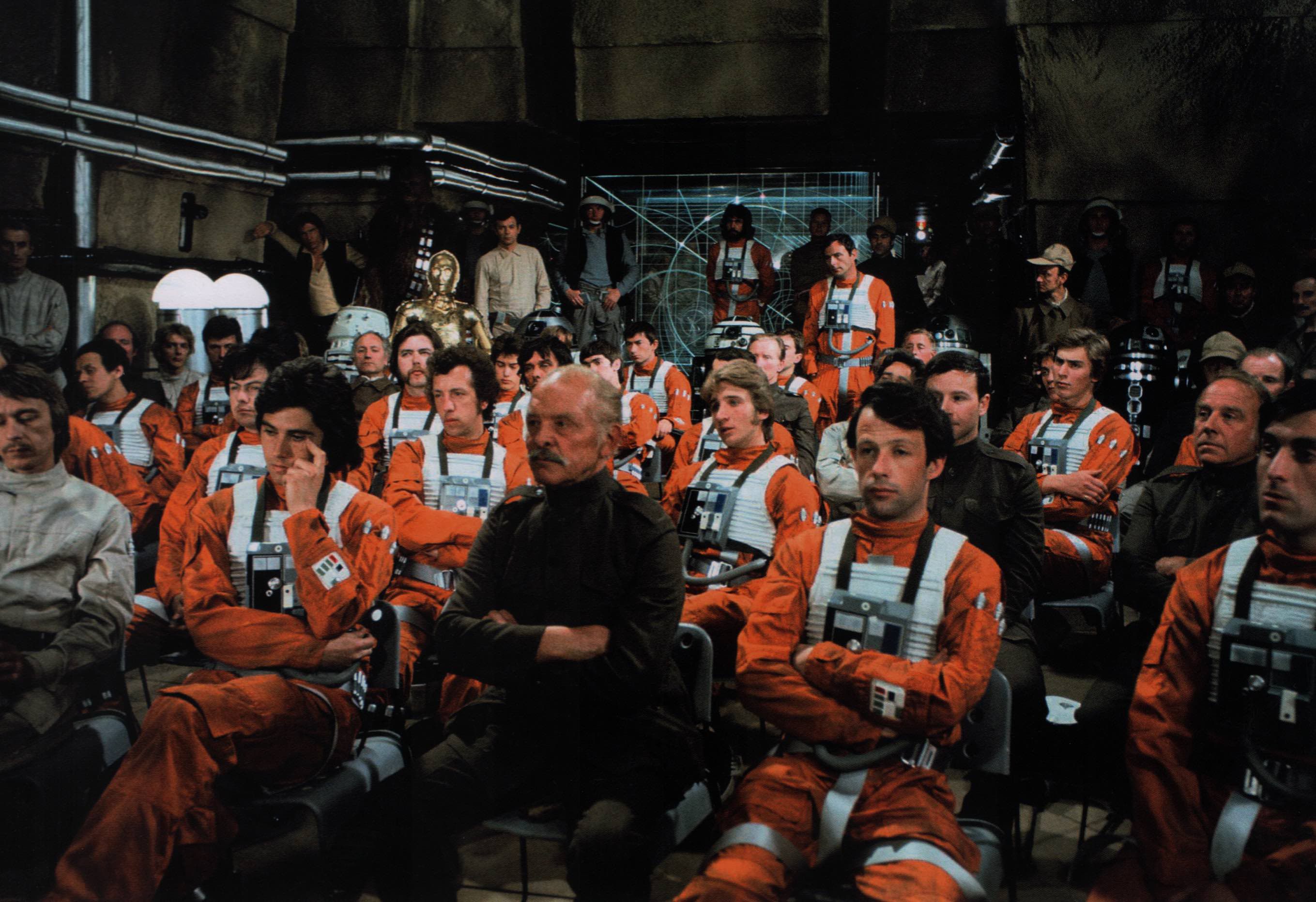
Finally, the Star Wars films, particular the original trilogy, make strong use of colour associations to immediately infer character information and visualize the conflict between good and evil. There is a strong visual contrast between the good Rebel Alliance and the evil Galactic Empire.
The monochrome white, blacks and greys of the Galactic empire conveys an unfeeling, depersonalized and dictatorial regime, with the black costumes of the Sith immediately connoting evil, death and of course the dark side.
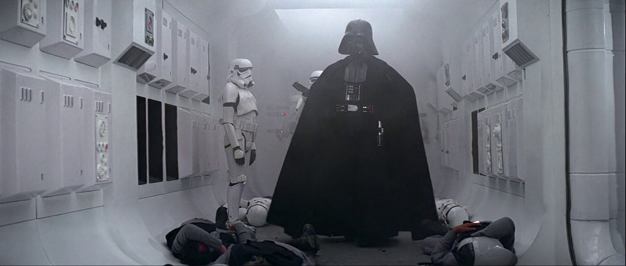
The only real elements of colour come from the bright red lightsabers, Imperial Guard and the flashing lights and buttons, which again carry connotations of evil and danger.

In contrast, the good, mindful Jedi wear earthy browns, beiges, and worn-down costumes, the Rebels wear uniformed but individually distinctive combat-wear and the blues and greens of their light-sabers conveys goodness.

As some have identified, many films have begun to adopt a predominantly teal and orange colour scheme because of the colours' complementary qualities.


The hair colour of Clementine changes throughout the film, stemming from her impulsive and expressive personality. As the scenes in Joel's mind work in reverse to erase his memory of her, these colours represent the various stages in their relationship, but also indicate to the audience when we are viewing a scene in the present day outside of Joel's mind.
Following the images above, working from the end of their relationship to the beginning, many have drawn comparisons to the four seasons; spring, summer, autumn and winter.
In the first image, after Joel has been erased from her memory, Clementine's hair is deep blue, connoting coldness and emotional vacancy, the end of their relationship. The colour is also being washed out from her hair, suggesting she has started anew.
In the second image her hair is bright orange, which links to the autumn theme and suggests the start of the decline in their relationship, losing the full-bodied, healthy brightness of the red in the next image (representing passion and love.)
Finally, in the last image we can see her hair at the start of their relationship, representing spring - the vital greens suggesting their relationship is in its early stages and is about to bloom.
Another film which makes use of seasons and colour palette changes to chart character arc is 'Requiem for a Dream' (Darren Aronofsky, 2000) - as seen in the image below. The warmth and brightness of the start of the film gives way to dark, dingy greens and greys, and unhealthy, de-saturated tones to represent the emotional decay of the characters.
In 'City of God' (Fernando Meirelles, 2002), a colour change is used to chart the decline of an entire community, providing the audience with a visual timeline. Spanning three decades, the film watches a group of children grow up to become involved in a dangerous criminal world, and the set design and grading is used for emphasis.
In scenes set in the 1960s, a golden, sepia tone is applied to the scene, creating a sense of warmth and nostalgia. The streets are wide open, allowing use of wide shots to create visual space.
By the end of the film, after 20 years of development, drugs and decline within the city, the colour has descended into a serious, shadowy blue hue - representing the end of the golden age and the danger that has replaced it. In addition, the built up area creates a strong visual contrast with the openness of the old favela, creating cluttered frames and a sense of claustrophobia as the characters navigate the narrow alleys - adding to the sense of danger and vulnerability that they each feel.
In the flashback sequences from 'Shutter Island' (Martin Scorsese, 2010), a sickly and in-complementary palette of highly saturated greens reds, purples and browns is used. The characters are also lit by unnaturally harsh lighting, stressing the surrealism of the scene.
The visual effects supervisor for the film talks about his this 'disconcerts the viewer and suggests that it has a sort of unrealistic property to it... it looks like it should be a real shot but something's not quite right about it.'
At the end of the film, it is revealed that the main character's memories of his wife are all false, and that he has created them as part of an alternate self. With this knowledge, we can see how the surrealism and unnatural colours in the flashback sequences are a subtle indication to the audience that these memories are not the truth and not to be trusted.
This is emphasised further when Teddy later relives the actual events which led to the death of his wife and children. As this is reality, the colours, lighting and other elements are all naturalistic.
Using monochrome with select saturated colours is also an effective tool to draw audiences to a part of a frame or to create symbolic links to themes, characters and/or emotions.
For example, in 'Sin City' (Frank Miller, 2005) specific objects or character traits are colourized to emphasize their importance and perhaps also to make symbolic links. For example, the colour red on a bed, a characters' lips or dress immediately connotes sensuality, love and passion.
The sickly yellows of the antagonist amplify our disgust and the contrasting greens and blues of two characters' eyes can be seen to connote deceit and innocence.
Another famous example of select colorization is 'Schindler's List' (Steven Spielberg, 1994) with the girl in the red coat, that has been deliberated by many - said to represent 'innocence, hope or the red blood of the Jewish people being sacrificed in the horror of the Holocaust'.
The select colorization is powerful in that it isolates a single body against the background of such mass suffering, alarming the audience to the scale of the atrocity and, when Schindler sees her body later on, marks the turning point where he no longer sees the ash as just 'an annoyance'.
In 'Minority Report' (Steven Spielberg, 2002), Spielberg wanted to bring out the film's neo-noir themes through the visual style - overlighting shots, using desaturated colours and creating a high contrast for dark colours and shadows.
The film's teal, white and washed-out blue hue has come to typify films of the science fiction genre with their associations with sterile, future technology. The stark contrast of black and white is appropriate when considering the film's narrative and themes, as the protagonist is stuck between right and wrong.
Living in a world where people are judged before they have even committed a crime, the character operates within the moral (and often literal) grey area, where we grow attached to him but question his final actions.

Furthermore, the effect of the 'slo-mo' drug is visually represented by an unnaturally high saturation, bloom, contrast and hues applied to the image - creating a hallucinatory experience for the audience.
Finally, the Star Wars films, particular the original trilogy, make strong use of colour associations to immediately infer character information and visualize the conflict between good and evil. There is a strong visual contrast between the good Rebel Alliance and the evil Galactic Empire.
The monochrome white, blacks and greys of the Galactic empire conveys an unfeeling, depersonalized and dictatorial regime, with the black costumes of the Sith immediately connoting evil, death and of course the dark side.
The only real elements of colour come from the bright red lightsabers, Imperial Guard and the flashing lights and buttons, which again carry connotations of evil and danger.
As some have identified, many films have begun to adopt a predominantly teal and orange colour scheme because of the colours' complementary qualities.
This color style has largely come about following the move to digital colorization in films, and is applied across many different genres, from sci-fi to comedy, action to drama.
Again, as many have noticed, colour is also a tool used by film-makers (and marketers) to immediately establish genre, and a number of conventions for colour styles have emerged following the onset of digital colorization. In this thesis, many of these colour associations are tested on movie posters, with different 'looks' being applied to the same image to convey distinct genre styles.
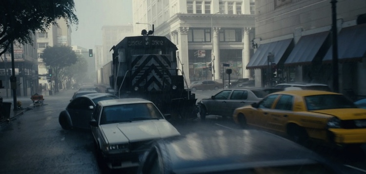
For example, apocalyptic movies use a predominantly gray and washed out, with bleached greens and beiges conveying the bleak, hopelessness of the times.
Whereas horror films have begun to use a dark blue hue to accentuate the shadows and create a cold, hostile environment for its characters.
An interesting case study to test these conventions is the film 'Cloud Atlas' (Wachowski, 2012), which has multiple concurrent narratives spanning different time periods and genres; from period drama to sci-fi, crime thriller and fantasy. As you see below, the colour schemes are varied but appropriate to these different time periods.
 |
| The future world of Neo Seoul follows the deep teal hues and bright neon of many sci-fi films. |
 |
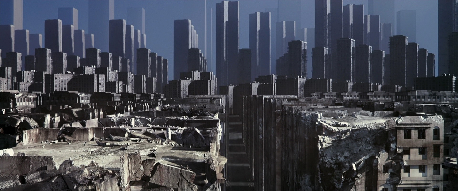
| The post-apocalyptic world uses greys, washed-out greens and browns to convey desolation |
 |
| The period setting uses rich golds, greens and purples to convey age and wealth |
 |
| The present-day story uses a naturalistic grade with elements of colour to convey its elements of comedy, and to create empathy with the character |
 |
| The colonial-era narrative uses browns, greens and yellows in the household, and earthy, sandy colours in the outside environments. |
 |
| The 1970s thriller story uses appropriate saturated colours and later a palette of orange, green and black to signify the times. |
As I have found in my research, manipulation of colour and colour theory can be important, if not essential, to many films as both a narrative and symbolic device. Applying such a flat grade, such as many modern films do, erases this opportunity to analyse and find meaning within the colour composition of a scene, which is why this style is largely (but not exclusively) confined to action films - where expressive colour use is not as important.
No comments:
Post a Comment